Filtros
filter: hue-rotate()
Utilidades para aplicar filtros de rotación de matiz (hue-rotate) a un elemento.
| Clase | Estilos |
|---|---|
hue-rotate-<number> | filter: hue-rotate(<number>deg); |
-hue-rotate-<number> | filter: hue-rotate(calc(<number>deg * -1)); |
hue-rotate-(<custom-property>) | filter: hue-rotate(var(<custom-property>)); |
hue-rotate-[<value>] | filter: hue-rotate(<value>); |
Ejemplos
Ejemplo básico
Utiliza utilidades como hue-rotate-90 y hue-rotate-180 para rotar el matiz de un elemento en grados:
hue-rotate-15
hue-rotate-90
hue-rotate-180
hue-rotate-270
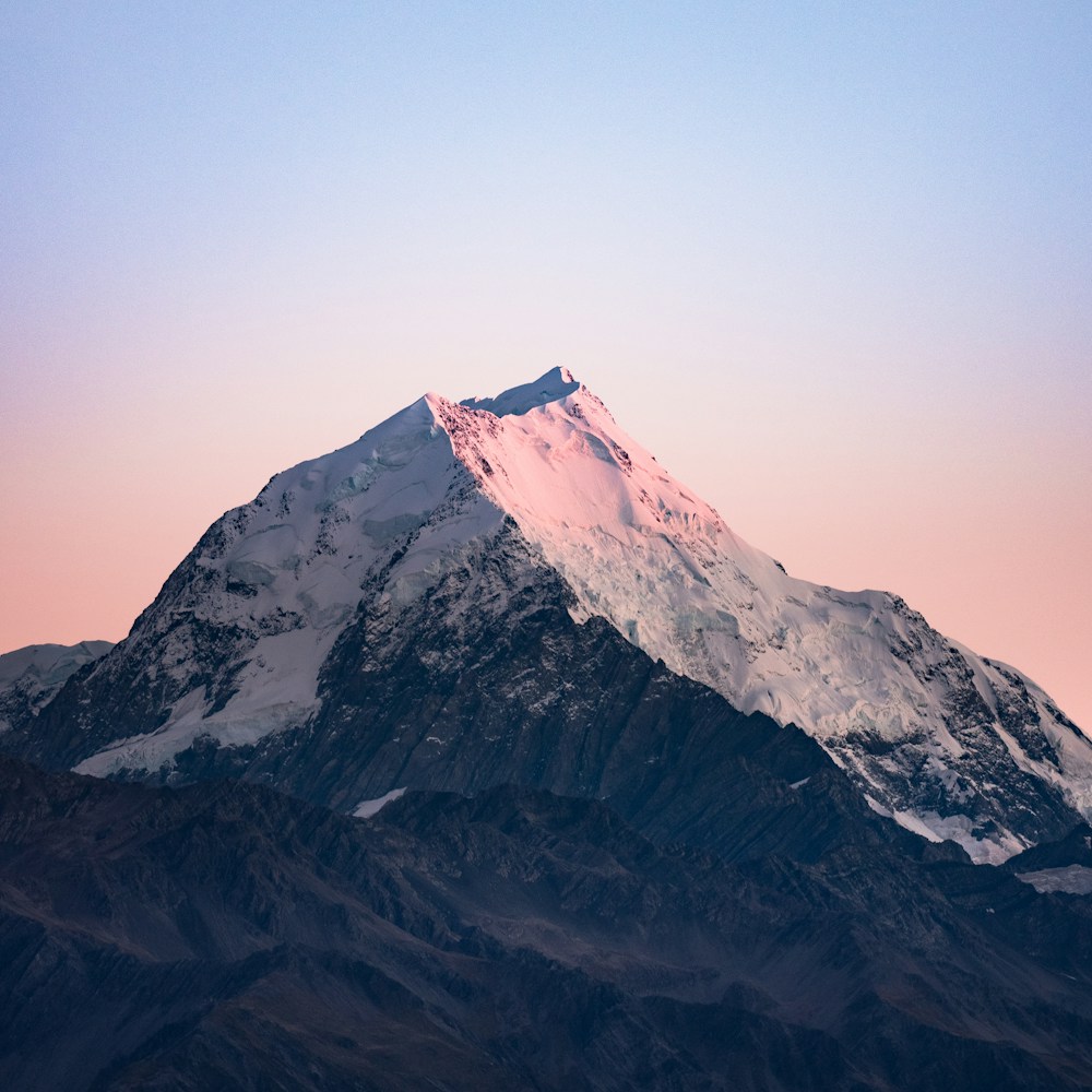
<img class="hue-rotate-15" src="/img/mountains.jpg" /><img class="hue-rotate-90" src="/img/mountains.jpg" /><img class="hue-rotate-180" src="/img/mountains.jpg" /><img class="hue-rotate-270" src="/img/mountains.jpg" />Usar valores negativos
Utiliza utilidades como -hue-rotate-15 y -hue-rotate-45 para establecer un valor de rotación de matiz negativo:
-hue-rotate-15
-hue-rotate-45
-hue-rotate-90
<img class="-hue-rotate-15" src="/img/mountains.jpg" /><img class="-hue-rotate-45" src="/img/mountains.jpg" /><img class="-hue-rotate-90" src="/img/mountains.jpg" />Usar un valor personalizado
Usa la sintaxis hue-rotate-[<value>] para establecer el/la rotación de matiz basándose en un valor completamente personalizado:
<img class="hue-rotate-[3.142rad] ..." src="/img/mountains.jpg" />Para variables CSS, también puedes usar la sintaxis hue-rotate-(<custom-property>) :
<img class="hue-rotate-(--my-hue-rotate) ..." src="/img/mountains.jpg" />Esto es solo un atajo para hue-rotate-[var(<custom-property>)] que añade la función var() por ti automáticamente.
Diseño responsivo
Antepone a la utilidad filter: hue-rotate() el prefijo de una variante de punto de ruptura como md: para aplicar la utilidad únicamente en tamaños de pantalla mediano y superiores:
<img class="hue-rotate-60 md:hue-rotate-0 ..." src="/img/mountains.jpg" />Obtén más información sobre el uso de variantes en la documentación de variantes.